AI artwork becomes easier to reuse when you keep the headline, offer and call-to-action outside the image. A copy change can then be a text edit instead of a new generation, and a narrow screen can rearrange the layout without shrinking the entire advertisement into one picture.
This walkthrough builds a working campaign hero from one generated illustration and one HTML file. It includes the actual creative brief, image prompt and complete page source. The result is a local demonstration you can adapt, not a live campaign or a claim about conversion rates.
Fictional example: Cedar Studio and its workflow-mapping workshop are invented. The sample takes no bookings and collects no personal information. The featured image is the AI-generated conceptual artwork used in the example, not a photograph of a real workshop or a screenshot of software.
Give each part of the campaign a clear job
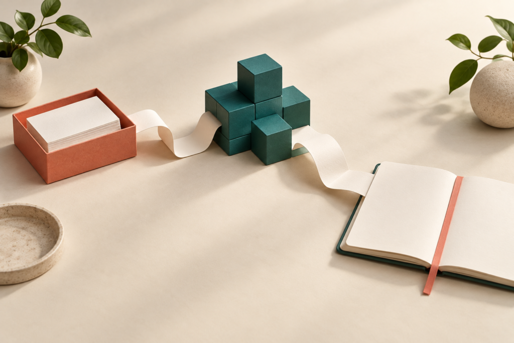
The artwork sets a calm, practical mood: a tray of cards, modular blocks and a notebook connected by a paper path. The HTML explains the workshop. The call-to-action takes the reader to an outline already on the page. No essential promise, date or instruction depends on reading pixels inside the illustration.
For a small business, this creates a useful handoff between the person reviewing the offer and the person producing the page. The offer can change without silently changing the artwork; the artwork can change without rewriting the offer. Both still need review together.
Here is the reusable brief for this example. Replace the fictional details with approved information before adapting it to a real business.
{
  "business": "Cedar Studio — fictional",
  "audience": "Owners and operators exploring a first repeatable AI-assisted workflow",
  "purpose": "Explain the workshop concept and lead readers to its outline",
  "headline": "Make one workflow easier to run.",
  "cta": "See the workshop outline",
  "destination": "#outline",
  "image_role": "Decorative conceptual illustration; all essential information is in HTML",
  "palette": ["#f4efe7", "#173c36", "#ad4326"],
  "forbidden_claims": ["Real customer results", "Guaranteed savings", "Actual event availability"],
  "review_state": "Fictional editorial demonstration; not approved for a real campaign"
}
Keep the destination as explicit as the headline. A button that says “Book now” needs a real booking flow. This example says “See the workshop outline” and points to #outline, so its promise matches its behavior.
Generate the visual without typesetting the whole page
The following prompt was used with the built-in image-generation tool. The returned PNG was 1536 × 1024 pixels and was inspected before use. It is the featured artwork at the top of this article.
Use case: ads-marketing
Asset type: a landscape campaign illustration, also the featured image for an AlgoThoughts tutorial about using AI art inside an editable HTML campaign hero.
Primary request: create a polished editorial illustration for a clearly fictional business workshop about mapping one repetitive workflow. Depict an elegant continuous folded paper path on a warm off-white tabletop connecting three tangible objects: a small input tray of blank cards, an orderly cluster of teal modular blocks, and an open blank notebook with a coral bookmark. The composition should communicate turning scattered work into a clear process, without implying a real product interface.
Style/medium: refined tactile paper sculpture and softly rendered 3D still life, strong art direction, subtle shadows, no people.
Composition/framing: landscape 1536 by 1024; all important objects comfortably inside the central 75 percent, generous breathing room on all sides. Entire image will be displayed as a separate panel beside HTML copy; do not draw any headline area, text boxes or mock browser frame.
Color palette: warm ivory, deep forest teal, restrained coral, natural paper textures.
Lighting: soft late-morning studio light, calm and purposeful.
Text: none. No letters, numbers, brand marks, watermarks, logos, labels, graphs, fake data or UI.
Constraints: conceptual AI-generated artwork; not evidence of a real workshop, customer or product. Three clear objects connected by one paper path.
The image is a creative interpretation, not a deterministic rendering of the prompt. In the returned composition, the notebook extends to the right edge. That is acceptable in the full-frame version used here, but it makes an aggressive portrait crop a poor automatic next step. Inspect the returned composition instead of assuming that a margin instruction was followed exactly.
Save the chosen image beside the HTML as featured.png. You can use a copy of this article’s featured artwork to reproduce the demonstration, or generate your own and inspect it. Retain the selected source file and exact prompt. A prompt alone does not guarantee you can regenerate the same pixels later.
Build an editable page around it
Save this complete file as campaign.html. It has no package dependencies, remote fonts, JavaScript, tracking or form submission. Open it in a browser with featured.png in the same folder.
Complete campaign.html source
<!doctype html>
<html lang="en">
<meta charset="utf-8">
<meta name="viewport" content="width=device-width, initial-scale=1">
<title>Cedar Studio | Fictional workshop concept</title>
<style>
  * { box-sizing: border-box; }
  :root { color-scheme: light; }
  body { margin: 0; background: #f4efe7; color: #173c36;
    font: 18px/1.6 system-ui, sans-serif; }
  main { max-width: 1200px; margin: auto; padding: clamp(20px, 4vw, 56px); }
  .identity { display: flex; flex-wrap: wrap; gap: 8px 24px;
    justify-content: space-between; border-bottom: 1px solid #b7c0b5;
    padding-bottom: 18px; font-size: .8rem; }
  .identity strong { font-size: 1.1rem; letter-spacing: -.03em; }
  .hero { display: grid; grid-template-columns: minmax(0, 1fr) minmax(0, 1fr);
    gap: clamp(24px, 4vw, 48px); align-items: center; padding-block: 64px 48px; }
  .eyebrow { font-size: .8rem; font-weight: 700; letter-spacing: .12em;
    text-transform: uppercase; margin: 0 0 16px; }
  h1 { font-size: clamp(2.4rem, 5vw, 4rem); line-height: 1.04;
    letter-spacing: -.05em; margin: 0; overflow-wrap: anywhere; }
  .lead { max-width: 38ch; margin: 24px 0; }
  .cta { display: inline-block; background: #173c36; color: #fff;
    padding: 13px 20px; border-radius: 4px; font-weight: 650;
    text-decoration: none; }
  .cta:hover { text-decoration: underline; }
  a:focus-visible { outline: 3px solid #ad4326; outline-offset: 5px; }
  figure { margin: 0; min-width: 0; }
  img { display: block; width: 100%; height: auto; border-radius: 8px; }
  figcaption { font-size: .72rem; line-height: 1.5; margin-top: 12px; }
  #outline { border-top: 1px solid #b7c0b5; padding-top: 24px; }
  h2 { font-size: 1.5rem; line-height: 1.25; margin: 0 0 14px; }
  ol { padding-left: 1.3em; max-width: 65ch; }
  .note { font-size: .8rem; max-width: 70ch; }
  @media (max-width: 760px) {
    .hero { grid-template-columns: minmax(0, 1fr); padding-block: 40px 32px; }
    .lead { max-width: none; }
  }
</style>
<main>
  <header class="identity">
    <strong>Cedar Studio</strong><span>Fictional workshop concept</span>
  </header>
  <section class="hero" aria-labelledby="campaign-title">
    <div>
      <p class="eyebrow">Workflow mapping workshop</p>
      <h1 id="campaign-title">Make one workflow easier to run.</h1>
      <p class="lead">Map a repetitive task, identify the handoffs, and choose
        one small improvement to explore with AI.</p>
      <a class="cta" href="#outline">See the workshop outline</a>
    </div>
    <figure>
      <img src="featured.png" width="1536" height="1024" alt="">
      <figcaption>AI-generated conceptual artwork. Cedar Studio and this
        workshop are fictional.</figcaption>
    </figure>
  </section>
  <section id="outline" aria-labelledby="outline-title">
    <h2 id="outline-title">Start with a process you can explain.</h2>
    <ol>
      <li>Describe the trigger, input and expected result of one task.</li>
      <li>Mark where someone must review, decide or hand work over.</li>
      <li>Choose a small experiment and define how to check its result.</li>
    </ol>
    <p class="note">Demonstration only: this page does not offer a real event,
      take bookings, collect contact details or make performance claims.</p>
  </section>
</main>
</html>
The important layout decisions are visible in the source. A two-column grid becomes one column below 760 pixels. Each grid track can shrink with minmax(0, 1fr). The headline wraps instead of being truncated. The image uses its natural proportions through width: 100%; height: auto, so this version displays the full frame at every checked width.
If you later put the illustration inside a fixed-size banner, choose the fitting behavior deliberately. MDN’s object-fit documentation explains that cover fills the box by clipping when proportions differ, while contain preserves the image and can leave space around it. Neither setting understands which object matters to your campaign.
The explicit image width and height describe the source proportions; CSS controls its displayed size. For a public production page, export appropriately sized, optimized assets and consider srcset and sizes as documented for the HTML image element. The original demonstration PNG is about 1.97 MB; this article does not claim that it is an optimized mobile download.
Keep the message available as text
The title is an h1, the outline has an h2, and the call-to-action is a native link. These choices make the page structure and action available beyond its visual arrangement. The MDN guide to semantic HTML explains why native elements are a useful starting point.
The campaign’s illustration has alt="" because it supplies mood while the adjacent HTML carries the workshop’s essential information. That follows the W3C guidance for decorative images. The same image receives descriptive alt text as this article’s featured visual. Context determines the choice: if an image conveys unique instructions, product details or chart data, empty alt text would lose information.
The body text’s specified color pair has a calculated contrast ratio of 10.57:1; the call-to-action text is 12.10:1. Both exceed the 4.5:1 threshold discussed in W3C’s text-contrast guidance. These two calculations do not establish full accessibility conformance. Keyboard behavior, meaningful text, zoom and assistive-technology use need their own checks.
What the worked example actually passed
The page was served locally using Python 3.14.3 and inspected in the Codex in-app browser on Windows on September 23, 2026. The exact browser build was not recorded.
- At a 1280-pixel viewport, the hero displayed two columns and the full artwork loaded.
- At 390 and 320 pixels, it stacked into one column with no horizontal document overflow. The artwork remained visible at its natural aspect ratio.
- Tab reached the call-to-action with a visible focus outline. Enter navigated to the intended
#outlinesection. - A separate 320-pixel check replaced the headline with “Map your busiest customer handoff before choosing the next AI automation.” It wrapped without horizontal overflow, and the link still fit. The extra height pushed the artwork farther down the page, which is a real layout tradeoff.
These were targeted browser checks and color calculations, not a conversion experiment, screen-reader audit, physical-device test or cross-browser certification. A longer headline fitting inside a column does not automatically make it good campaign copy.
Use a review loop that does not waste the asset
- Review the offer first. Confirm the audience, claim, action and destination before generating a visual. Do not let attractive artwork conceal an unclear promise.
- Select the artwork. Inspect objects, accidental lettering, edge placement and visual implications. If it looks like documentary evidence of a product or event, make sure that representation is accurate or use a clearly conceptual direction.
- Place it in the real layout. Check the narrowest supported width and a realistic longer headline. Correct the layout or request a targeted image revision rather than regenerating every part.
- Record the approved combination. Keep the brief, copy, prompt, selected asset, HTML and review notes together. A file hash can identify the exact approved artwork; it cannot replace editorial approval.
If the image fails to load, the headline, description and destination still live in HTML. If a future campaign needs text over photography, you will need to check contrast over the actual background, not reuse the solid-color calculation above. If a social platform requires a flattened graphic, export and inspect that format separately; the responsive web page is not proof that a social crop works.
This pattern can become part of a reusable business-brief skill: the agent receives an approved brief, prepares artwork and layout, and returns a reviewable package. The useful automation boundary is a complete candidate with evidence of what was checked. A real campaign still needs approval of its offer and destination before launch.
For your next campaign, start with one approved message and one visual. Keep both editable, test them together and save the exact version you are willing to publish.
Published by Jason Ead. My Biz Heroes connects this practical approach to websites, automation, workflows, AI tools and training. Cedar Studio is a fictional example, not a My Biz Heroes client or case study.